
Data Classification, Clustering, and Regression is part 5 of this series on Data Analysis. The focus of this article is to use existing data to predict the values of new data.
What is Classification?
The classification of data is when we sort our data into different buckets. Imagine having buckets with labels: blue, red, and green and a pile of marbles. Classification would be like picking up each marble, deciding which bucket it belongs in, and placing it in there.
The first step in classifying data is splitting up the data set. We have to split the data set into at least 2 sections: the training set and the testing set. It is common to split it into 3: training, testing, and validation sets. We use the training set to teach our model how to classify data points based on some of their feature values. Then we can use the testing set to test how accurate the model is. From there, we can tweak the model and its training until we get an accuracy that we feel is a good representation of accuracy. Next, we use the validation set to make sure we haven’t overfitted the model to the existing data. We want to prevent the model from just ‘memorizing’ the data set and instead be able to predict values it hasn’t seen before.
There are lots of methods for training a classification model. The first allows the model to guess the most common answer. So, if 20% of the time a data point falls in category A and 80% it falls in category B, the model would predict category B and be correct 80% of the time. Being correct 80% isn’t terrible, but it does mean anything added on is labeled category B, not taking into account the other 20% of category A. This skews the results, changing the percentages in favor of category B.
Another option is to use one attribute to predict the category. This is called the one-r algorithm. You commonly do this with the k-nearest neighbor algorithm. Let’s pretend we have existing data that looks like Figure 1, where the red square is the new data point, and we are trying to figure out which shape it should be.
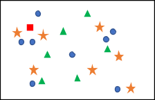 Figure 1
We then pick a k, which is the number of neighbors we are going to check. It can be tweaked until you find the value where the highest accuracy found. Let’s say we pick k to be 5. We would look for the 5 points that are closest to the point we are trying to identify, figure out the distributions, and pick the category with the most in it. Figure 2 shows what the k-nearest neighbor would look like on this data set.
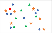 Figure 2
Out of the 5 nearest neighbors, 3 of them were circles, and 2 of them were stars, so we would say that our new data point is a circle. This algorithm can be very slow when there are many features or dimensions, as finding the k nearest neighbor in a 100-dimension space takes a while.
Other algorithms for classifying include decision trees and support vector machines. All of these algorithms have an accuracy score based on the dataset to determine the right algorithm for your specific set. Accuracy is a measure of how often our model guessed correctly. Accuracy is determined by a recall score, a number describing how well the model is at identifying the right category. In other words, how much of the data in category A belonged in it? Another type of score is the precision score, which measures how accurately our model assigns the data into its right category. So, instead of the data being statistically correct (20% of data in category A, 80% of data in category B), it measures how precise the placing of each singular point of data is, (Data point 1 belongs in category B, where did it end up)? These two scores, when combined, turn into an F-score, which is a value between 0 and 1, where 0 is a very inaccurate model, and 1 is a perfect model.
Going back to our bucket and marble example, what would happen if we didn’t have any buckets? If we only had a pile of different colored marbles, what would be the best way to group them? That is where clustering comes in.
What is Clustering?
One of the primary sorting functions we can do with our data is to group them based on their similar attributes. This technique is called clustering. Clustering is useful when you don’t want to label things by hand, don’t know what the labels are ahead of time, or when labels are too hard to figure out. In our bucket and marble example, this would be like creating piles on the ground of all the separate colors. A more formal example would be a scatter plot like the one found in Figure 3.
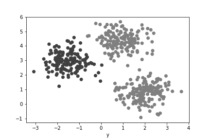 Figure 3
As humans, it’s easy for us to see the 3 separate groups that formed in Figure 3. If we color-coded each group, it would look something like Figure 4.
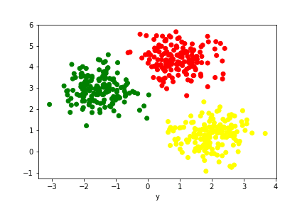 Figure 4
But how do we teach a computer to recognize those groupings? There are a few different algorithms; for our data, we focus on 2 basic ones: k-means, and PAM.
The k-means algorithm starts by picking a “k,” which represents how many clusters we think there are in the data. From there, we pick “k” (number) random positions in the space and have them be the centers of the clusters. Looking at the data set in Figure 5, we can pick a “k” value. For this example, “k” is 5.
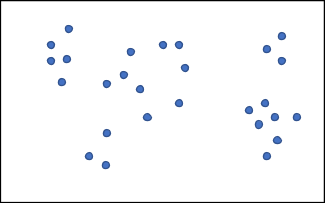 Figure 5
Now we need to pick 5 random locations (or areas, not points) to be the centers of our clusters. That might look something like Figure 6.
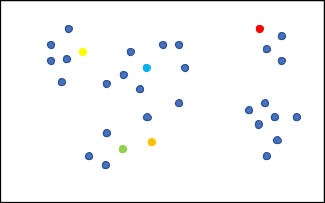 Figure 6
The next step in the algorithm is to iterate through all the points, figure out which of the center points it is closest to that area and assign it to that group. The result of this part of the algorithm on our example data set would look like Figure 7.
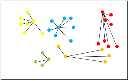 Figure 7
Next, we inspect each cluster. By taking the distance from each point to the center point’s position, we assign them to the closest cluster. The new center positions are in Figure 8.
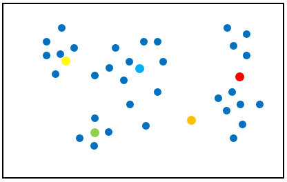 Figure 8
After many iterations of this process, the computer figures out the clusters in the data and label them appropriately. Eventually, the centers stop moving, which means that the algorithm has finished. There are a few drawbacks to this algorithm. Since the initial centers of the clusters are random, they are prone to inaccuracy. This process repeats until it stops moving the center, which can take a while. Also, outliers in the data can cause issues when taking the average position of a cluster. The outlier can pull the center further away from the actual center of the cluster.
Another clustering algorithm we can look at is called PAM, which stands for partitioning around medoids. This algorithm looks very similar to k-means except for instead of choosing random areas for the clusters, we randomly choose which data points are the centers. Let’s do a more straightforward example with a data set with a k of two, which is seen in Figure 9.
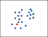 Figure 9
After randomly picking two data points to be the centers of the clusters and iterating through all the other points and assigning them to the closest cluster (see Figure 10), we can calculate the error.
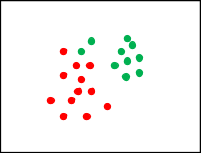 Figure 10
The error is the total distance from each point to the center point of the cluster. So, if the point is close to the center, the error is small. When the point is on the edge of the cluster, it is far from the center, therefore increasing the error. From here, the algorithm simply picks a different data point in each cluster to be the new center point and calculates the error (this finds the center of the cluster). If the error calculated is more significant, it moves the center point back to where it was previously. If the error calculated is smaller, that point becomes the new center point.
Over time, the algorithm notes that no matter where it moves, the error always increases, which means it found the right point closest to the center of the cluster. In this algorithm, outliers have less of an impact because it can’t move the center position to an outlier as the error would be too large.
What happens if it doesn’t make sense to group the data? For example, if I have a scatter plot of people heights versus their weights, there is no logical way to group that data. One way to handle this kind of data is through regression.
What is regression?
When we have data that doesn’t neatly fit into one category, meaning it qualifies into two or more of the categories, use regression. Regression is using an existing trend to predict an unknown value. One of the more natural examples of regression is linear regression, just like in Algebra classes. It is known as ‘finding a line of best fit.’ So, let’s say we start with a set of data that looks like Figure 11. Where the x-axis is our input value, and the y-axis is our output.
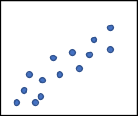 Figure 11
Recall from algebra that the formula for a line is y=mx+b, where m is the slope of the line, and b is the y-intercept or the point where the line crosses the y-axis. The point of linear regression is to create the best fit line that is as close as possible to each data point. So, in this example, the line of best fit would probably look something like Figure 12.
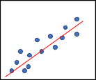 Figure 12
Now, if we have a new value that we want to find an output value for, we can just figure out where it would land on the line. You start at the x-axis where the value is and move up until you hit the line, and that would be the output value (see Figure 13).
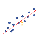 Figure 13
Once we have a model, regardless of how we generated it, we can calculate our error: the average distance between what the correct answer was and what our prediction was. Most methods to calculate error involve taking the difference between what you predicted and the actual value, adding them up, and dividing by how many there are.
If we do our error calculation this way, we could end up with an error of zero. An error of zero means we overestimated half the time and underestimated the other half.
When this happens, we can run ‘mean absolute error,’ which is when we take the absolute value of the difference between the prediction and the actual before adding them all up and dividing by the number of instances. Another option to quantify the negative predictions is to square the difference, add them up, then divide by how many there are, and lastly, take the square root of that number. Also, this is known as the root mean square error. After we get our error, we can tweak our model to minimize that value until we are happy with its accuracy.
This concludes the Data Analysis Series! Together we have defined what data is, techniques for data visualization, cleaning raw data, and of course, classification.