
This is part 3 of this series on Data Analysis. The focus of this article is all the different types of data visualizations and the reasons you might choose each one.
What is Data Visualization?
Data visualization is a representation of data in the form of a graphical chart, diagram, or picture. There are many kinds of visualization techniques, which makes it possible to pick a visualization that fits your data and the point you are trying to get across. We will only touch on the most basic ones in this article.
Why do we visualize data?
Visualizing data is essential for exploring the data to find trends/patterns and draw conclusions that may have been hard or impossible to see otherwise. We must pick the right visualization technique for our data because using inappropriate graphs can lead us to draw incorrect conclusions about our data.
Bar Chart
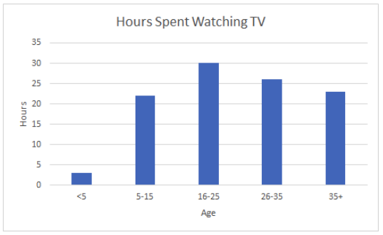
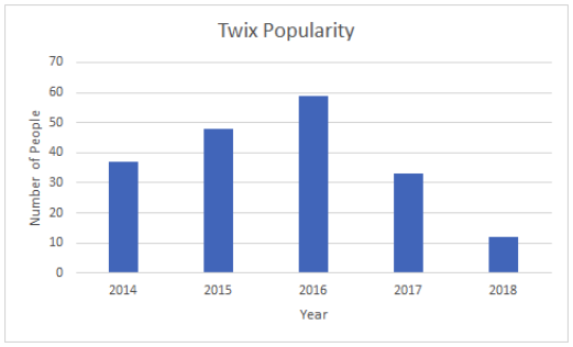
Use bar charts when you are comparing between groups or tracking changes over time.
In the bar chart on the left, we are using a bar chart to track a change over time, while on the right we are comparing between two groups. These are the two most basic examples of bar charts. There are many modifications to this, such as stacked bar charts, grouped bar charts, etc.
Pie Chart
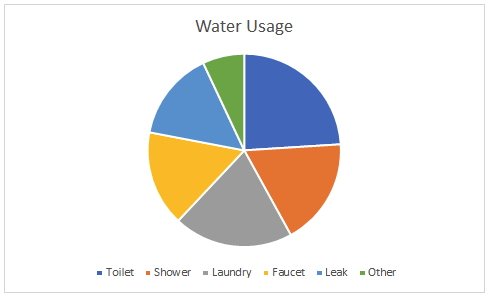
Pie charts represent the percentage or portion of data that fits into each category on a particular subject.
In the example above, you can see that we are looking at what percentage of our water usage fits into each category. This is a perfect example of when to use a pie chart. It’s best if your percentages add up to 100% or close to it. There are more sophisticated versions of pie charts, such as donut plots, which is a pie chart inside a pie chart. You’ll notice that pie charts are very hard to read and understand, there are some instances where a pie chart might be useful, but they are typically avoided.
Box Plot
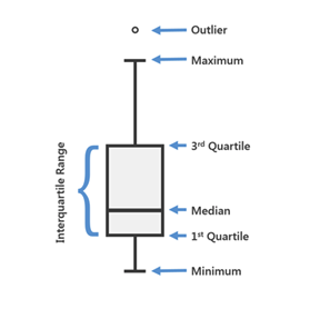
Box plots are the most statistical data visualization on this list. The plot determines the shape of the data and how it is distributed. There is a lot of data in a box plot. Let’s look at what it can tell us about the data.
Taken from: https://pro.arcgis.com/en/pro-app/help/analysis/geoprocessing/charts/box-plot.htm
There are some obvious statistics here like minimum and maximum, which are the smallest and largest numbers in the data set, respectively. The median is the data point in the middle of the data set. Medians are often confused with the mean or the average, but they are not the same thing. In the data set: 2,2,3,10,20, the median would be 3 because it is in the middle of the ordered list, while the mean is 7.4. The first quartile is simply the median of the first half of the data. So, imagine taking an ordered list, finding the median, and turning it into two separate lists. The data set 2,2,3,10,20 would turn into two lists: 2,2 and 10,20.
While there is no rule for how to determine the median of an even number of data points, the most common and most accepted method is to take the average of the middle two points. So, in our case, the first quartile (or median of the lower half of the data set) is 2 because the average of 2 and 2 is 2. Our third quartile (or median of the upper half of the data set) is 15 because the average of 10 and 20 is 15. The interquartile range is a fancy term for the distance between the 3rd quartile and 1st quartile. Data points on the graph show any outliers in the data set. An outlier is a data point that is significantly far away from the rest of the data. Outliers are determined by the analyst and what they consider far away from the main cluster of data points.
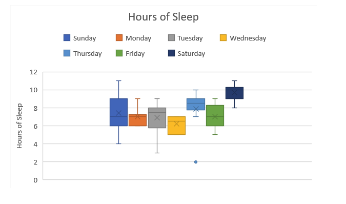
The example above shows the distribution of how many hours of sleep this person got over multiple weeks. We can see that on Sundays, they had anywhere between 11 and 4 hours of sleep. On Wednesdays, they were much more consistent, keeping their sleep between 5 and 7 hours per night. There is one outlier on the graph. On one Thursday, this person got 2 hours of sleep, but the rest of the Thursday nights were between 7 and 10, so 2 is considered an outlier.
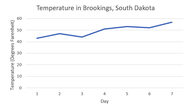
Line Graph
Line graphs, like bar graphs, are useful for tracking changes over time. Typically, the reason for picking a line graph over a bar graph is when smaller variations between points exist.
Histogram
Histograms look very similar to a bar graph except that histograms measure the frequency of occurrences in a data set. It shows how many times any category or numerical value shows up in the data set.
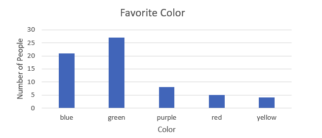
This histogram shows us that in our data set, five people chose red as their favorite color, 27 chose green, and so on.
In our next blog, we will go over how to effectively clean the data to make your visualizations more meaningful.
Part 4: Cleaning Data will be available very soon. In the meantime, follow our linkedin page for more great content!
Resources:
https://www.kaggle.com/c/titanic/data