
This is part 2 of this series on Data Analysis. The focus of this article is all the different types of data and how each one can be analyzed.
It’s important that we understand what our raw data represents because we can’t use it properly if we don’t know what it is. One of the key things we can do to eliminate this problem is understand the universally accepted format for data. Consistency in formatting is vital for making the data usable. Typically, data is stored in a table or a 2-d array format that looks something like this:
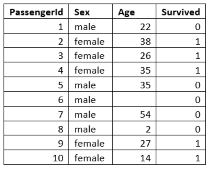
You’ll notice that the first row (aka column headers) are all of the attributes or variables for our data set. The rows represent the instances of data that we have. These rows can also be referred to as observations. The last column is typically the ‘output’ column. The easiest way to understand this concept is to think about it in terms of Machine Learning Applications. The final column is the information that you want the machine learning model to be able to give you. So, ultimately, I would like to be able to input the passenger’s gender and age and have it evaluate if they survived or not, making survival our ‘output’ variable, and therefore, our final column.
There are four common data types in data analytics, commonly referred to with the acronym “NOIR”, which stands for Nominal, Ordinal, Interval, and Ratio. All of these data types are similar, but have some distinct differences.
Nominal Data
Nominal data is data that can’t be ordered and the distances between two data points can’t be measured. A good example of this is colors. If you have a column in your data set full of color names, that would be considered nominal data because colors have no particular order. It is also impossible to say that one color is exactly some amount more or less than another color, which means distances between those colors can’t be measured. The only meaningful analysis that can be pulled from nominal data is the mode, which is the most frequent answer.
A common mistake that people make is turning nominal data into codified data and assuming they can perform more in depth analysis on that data. For example, taking every instance of ‘red’ in my data set and turning it into a ‘1’ and every instance of ‘blue’ into a 2 and so forth, and then assuming the analysis of this data would provide greater insight. Let’s see an example of why this wouldn’t work.
Let’s say I took a survey of 10 people and asked them what their favorite color is and got these results:
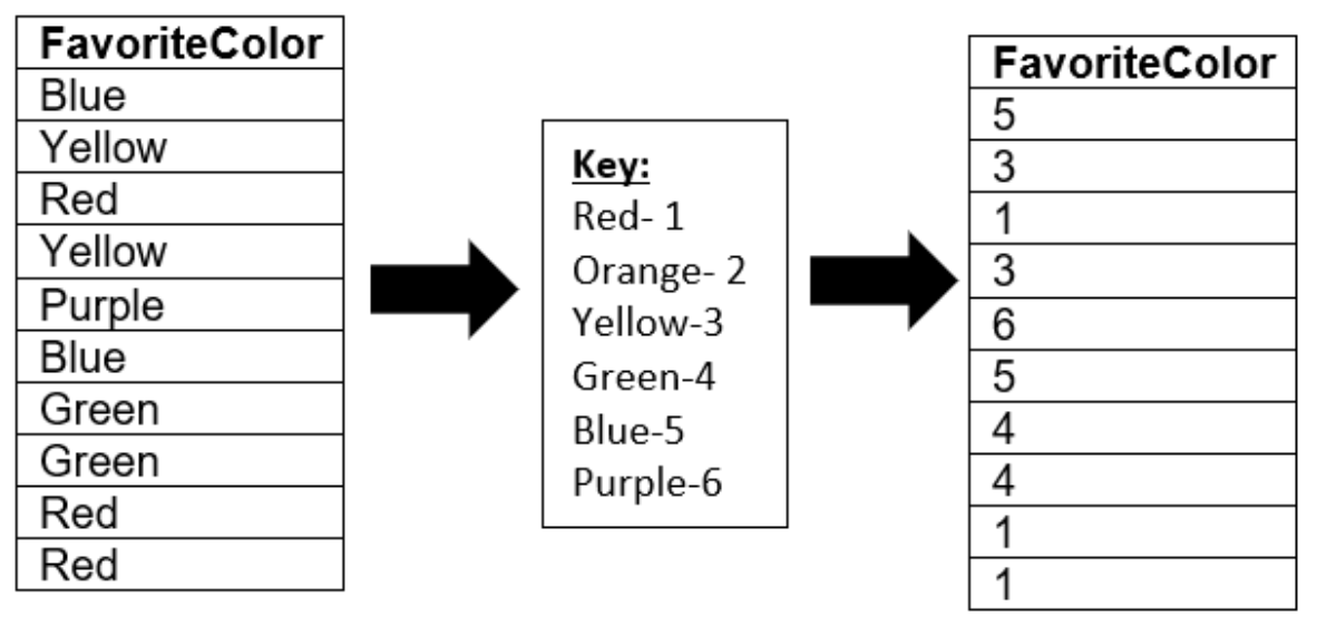
A really common statistic to find on a column of numbers is the average, which is the sum of all the numbers divided by how many numbers there were. The average of this data is 3.3. If we tried to explain this number in words, we would say that on average, our participants chose something between yellow and green as their favorite color. Note that this isn’t accurate, plus it’s impossible to use our key to convert 3.3 back into a color.
Ordinal Data
The second kind of data is Ordinal data, which is data that can be ordered, but distances can’t be measured. The classic example of this is the places that people received in a race or a competition of some kind. It’s easy to put those in order from first to last or last to first, but you can’t tell how far apart the person in first and the person in second were. The mode (number that occurs most frequently in the set) is still meaningful in this case, and we can also find the median, which is the data point in the middle of our list.
Interval Data
The third kind of data is Interval data, also known as cardinal data. This data can be ordered and distances can be measured, but there is no absolute zero. A good example of this is degrees Celsius or Fahrenheit. If we have a list of average daily temperatures, we can put it in order from coldest to hottest or vice versa and we can say that 10 degrees is half of 20 degrees. However, there is no absolute zero because zero degrees does not mean ‘no temperature’ as you can go lower than zero degrees. Zero degrees is still a temperature. With this kind of data, we can find the mode, median, mean (or average), and a range, which is a value of how spread out the data is.
Ratio Data
The last kind of data is Ratio data, which is ordered, distances can be measured, and there is an absolute zero. A good example of this is if you have data on how many pets a group of people have. We can order that data from lowest to highest or vice versa and we can say that 6 dogs is 3 times 2 dogs. Also, having zero pets would mean ‘no pets’. This data is most flexible for analysis. We can use this data to find the mean, median, mode, range, and we can perform lots of other statistical tests like t-tests on it.
So, if we go back to the titanic data that I will be using throughout this series, we can see all these different kinds of data. The descriptions for the attributes or variables in that data set can be found below:
| Variable | Definition | Key |
| survival | Survival | 0 = No, 1 = Yes |
| pclass | Ticket Class | 1 = 1st, 2 = 2nd, 3 = 3rd |
| sex | Sex | |
| Age | Age in Years | |
| sibsp | # of siblings / spouses aboard the Titanic | |
| parch | # of parents / Children aboard the Titanic | |
| ticket | Ticket Number | |
| fare | Passenger Fare | |
| cabin | Cabin Number | |
| embarked | Port of Embarkment | C = Cherbourg Q = Queenstown S = Southampton |
You can see that in this case, the ‘embarked’ variable would be a Nominal data set. It cannot be ordered and distance cannot be measured. The ‘pclass’ column would be an example of Ordinal data because it can be ordered, but distances between the different classes cannot be measured. The ‘age’ column would be an example of Ratio data since it can be ordered, measured, and it has an absolute zero because you can’t be younger than 0 years old. Lastly, this data set does not have an example of Interval data.
There are also two examples of codified data in this data set. The ‘survival’ and ‘pclass’ columns hold numerical values that represent a different value.
Part 3: Data Visualizations will be available next Thursday, February 20. In the meantime, follow our linkedin page for more great content!
Resources:
https://www.kaggle.com/c/titanic/data